
Visual Analysis
From dimensions and measures to interactive dashboards — everything is drag and drop, no frontend code required. Erupt Cube provides full BI capabilities: multiple chart types, multi-dimensional filters, and a flexible grid layout system.
Dashboard Overview
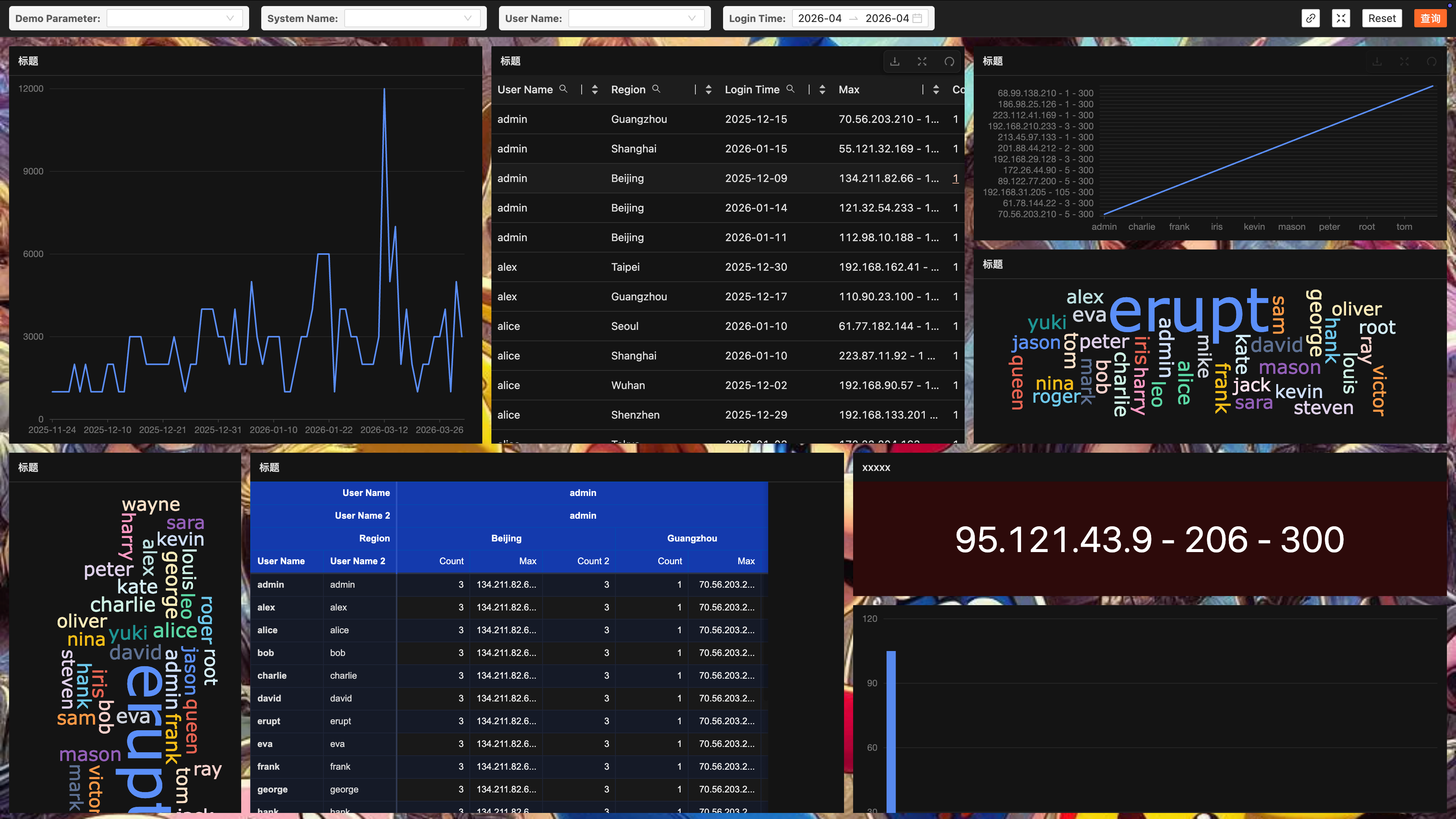
An order-analysis dashboard built on the semantic model, showing a typical layout of KPI cards, bar charts, pie charts, and line charts.
Drag-and-Drop Workflow
Drag a dimension or measure from the field panel onto the canvas to generate a chart instantly — no configuration code at any point.
- Drag in dimensions — pick dimensions (channel, city, date, ...) from the left field panel and drop them on the chart's X axis or grouping area.
- Drag in measures — pick numeric measures (order count, revenue, ...) and drop them on the Y axis or value area; the chart refreshes with aggregated results.
- Switch chart types — click the type switcher in the chart's top-right corner to flip between bar, line, pie, and more with one click, no reconfiguration.
- Adjust layout and size — move chart cards around the grid, drag corners to resize, then save to publish the dashboard.
Chart Types
Ready out of the box, covering common business analysis scenarios — no extra plugins.
| Chart type | Best for |
|---|---|
| 📊 Bar chart | Category comparison, rankings |
| 📈 Line chart | Trends, time series |
| 🥧 Pie chart | Proportions, category breakdown |
| 🔵 Scatter plot | Correlation, distribution |
| 📉 Area chart | Cumulative volume, stacked trends |
| 🟦 Heat map | Density, cross analysis |
| ⬜ Table | Detail rows, multi-dimensional comparison |
| 🔢 KPI card | Core metrics, period-over-period trends |
| 🗺️ Map v2.1.1+ | Regional distribution, geographic analysis |
Map Report v2.1.1+
A choropleth map backed by ECharts geo rendering:
- GeoJSON source: select from the built-in map registry (code + name + uploaded GeoJSON file) or provide a GeoJSON URL manually
- Region matching: match data by region name or administrative division code (adcode)
- Interaction options: toggle zoom/roam and region labels
- Drill-down linkage: clicking a map region triggers drill-down filtering, with all other charts responding in sync
Filter Types
A variety of filter widgets with linked filtering — all charts respond to the same filter context.
| Filter | Description |
|---|---|
| 🔽 Dropdown | Single-value enum filter |
| 📅 Date range | Start/end date interval |
| 🔢 Numeric range | Min/max bounds |
| 🔍 Fuzzy search | Keyword matching |
| ☑️ Multi-select | Multi-value IN filter |
| 🔘 Radio | Mutually exclusive options |
| 📆 Relative time | Presets like last 7 days / this month |
Layout & Interaction
| Capability | Description |
|---|---|
| 🖱️ Drag to build | Drop dimensions and measures from the field list to create charts instantly |
| ⊞ Grid layout | Dashboards align to a grid system; cards snap neatly into place |
| ↔️ Free resizing | Drag card corners to resize and allocate space per chart |
| 👁️ WYSIWYG | Edit and preview modes stay in sync in real time — changes show immediately |
| 🔽 Linked filtering | Any filter change updates every chart on the dashboard simultaneously |
Prerequisites
Visual analysis relies on the semantic model layer. Complete the setup in this order:
- Connect a data source — configure the JDBC connection (MySQL, ClickHouse, PostgreSQL, ...) in the Data Source module.
- Define semantic models — configure dimensions, measures, and SQL templates in the semantic layer to give charts business-friendly fields.
- Create a dashboard — open the Dashboard module, click "New", and build your board by drag and drop.
Contributors
 YuePeng
 Claude Fable 5.1