
UI & Interaction
Erupt's screens are generated from annotations, but how comfortable they are to use is not. Everything below ships enabled, needs no configuration, and is mostly remembered per user and per model in the browser — reopen a page and it looks the way you left it.
Appearance Settings
The ⚙️ button in the top-right opens the Page config drawer; every change applies immediately:
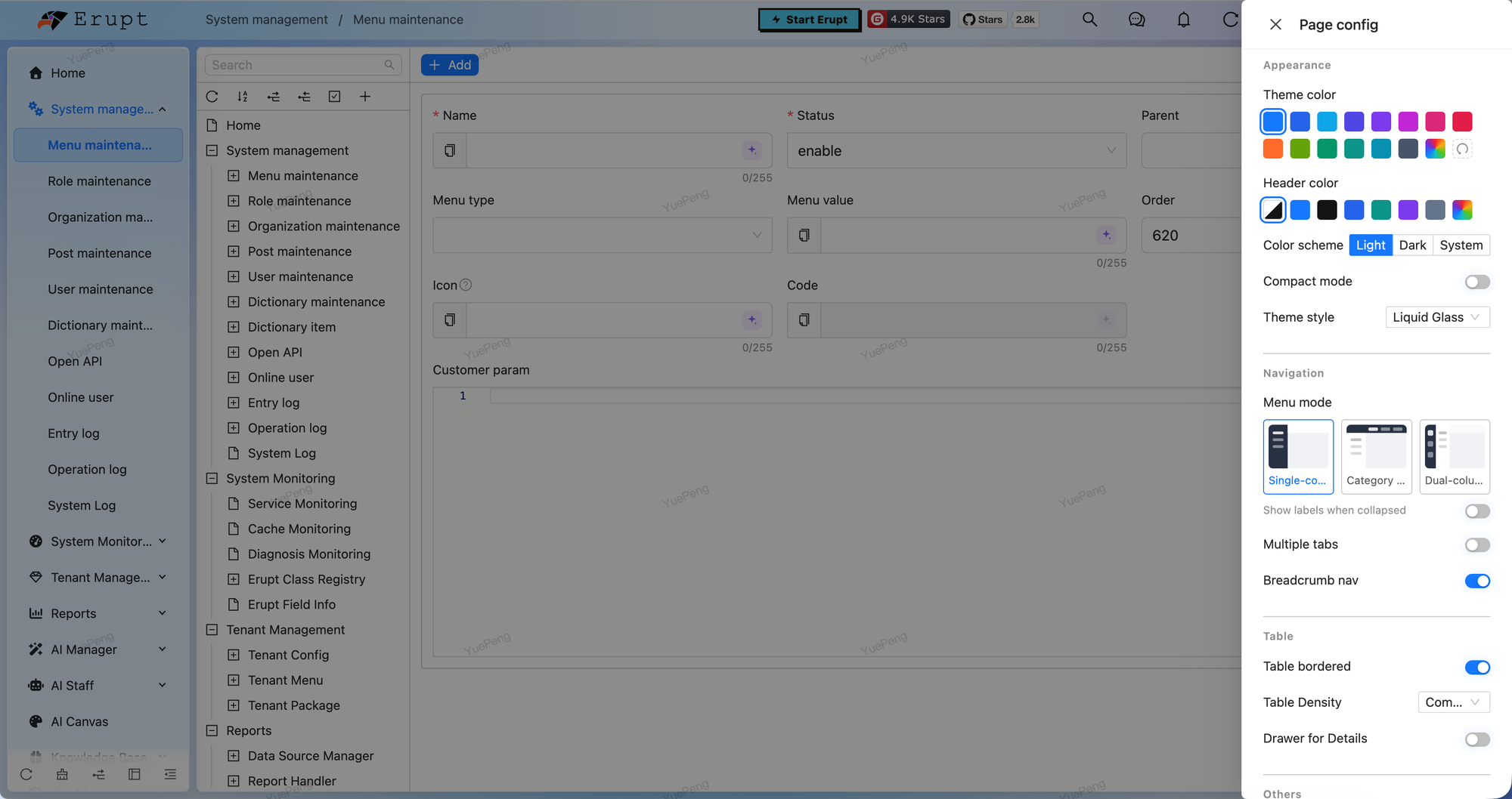
Appearance
| Setting | What it does |
|---|---|
| Theme color | 18 presets plus a color picker, and a reset back to the default rgb(22, 119, 255) |
| Header color | Follow the theme / follow the theme color / a preset / a custom color |
| Color scheme | Light / Dark / System (System follows the OS live) |
| Compact mode | Tightens spacing to fit more on screen; combines with dark |
| Skin | Default / Brutalist / Liquid Glass — mutually exclusive |
Navigation
| Setting | What it does |
|---|---|
| Menu mode | Single-column / Category (top-level categories in the header) / Dual-column (icon rail plus a submenu column) / Top (the whole menu in the header, no sidebar, content spans the full width) |
| Show labels when collapsed | Menu names under the icons once the sidebar is collapsed |
| Multiple tabs | Pages are reused as tabs so you can jump back between menus |
| Breadcrumb nav | The path bar at the top (turned off automatically in the category and top menu modes) |
Table
| Setting | What it does |
|---|---|
| Table bordered | Whether cell borders are drawn |
| Table density | Compact / Middle / Large |
| Drawer for Details | Open details in a right-hand drawer instead of a centered dialog |
Others
Color-weak mode, grayscale mode, RTL layout, and a button to clear the local cache.
Defaults vs. personal choice
theme (primaryColor, headerColor, dark, compact, skin, menuMode) and tabReuse in app.js are the system defaults — see Frontend Configuration. What a user picks in this drawer is stored in their browser's localStorage and wins. Clearing the cache returns them to the defaults.
Resizable Layout
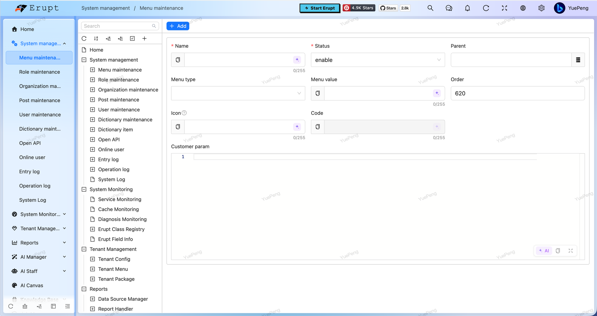
| Area | Range | Remembered |
|---|---|---|
| Sidebar menu | 150px – 400px | Globally — long menu names fit in one go |
| Tree panel beside a table | 120px – 600px | Per model, and collapsible entirely |
| AI assistant panel | Drag to size | Open state and width, per model |
The sidebar footer carries a small toolbar: refresh the menu, reset, expand / collapse all, switch menu mode. The search box at the top searches menus, showing matches with their full path — press Enter to jump straight there.
Table Capabilities
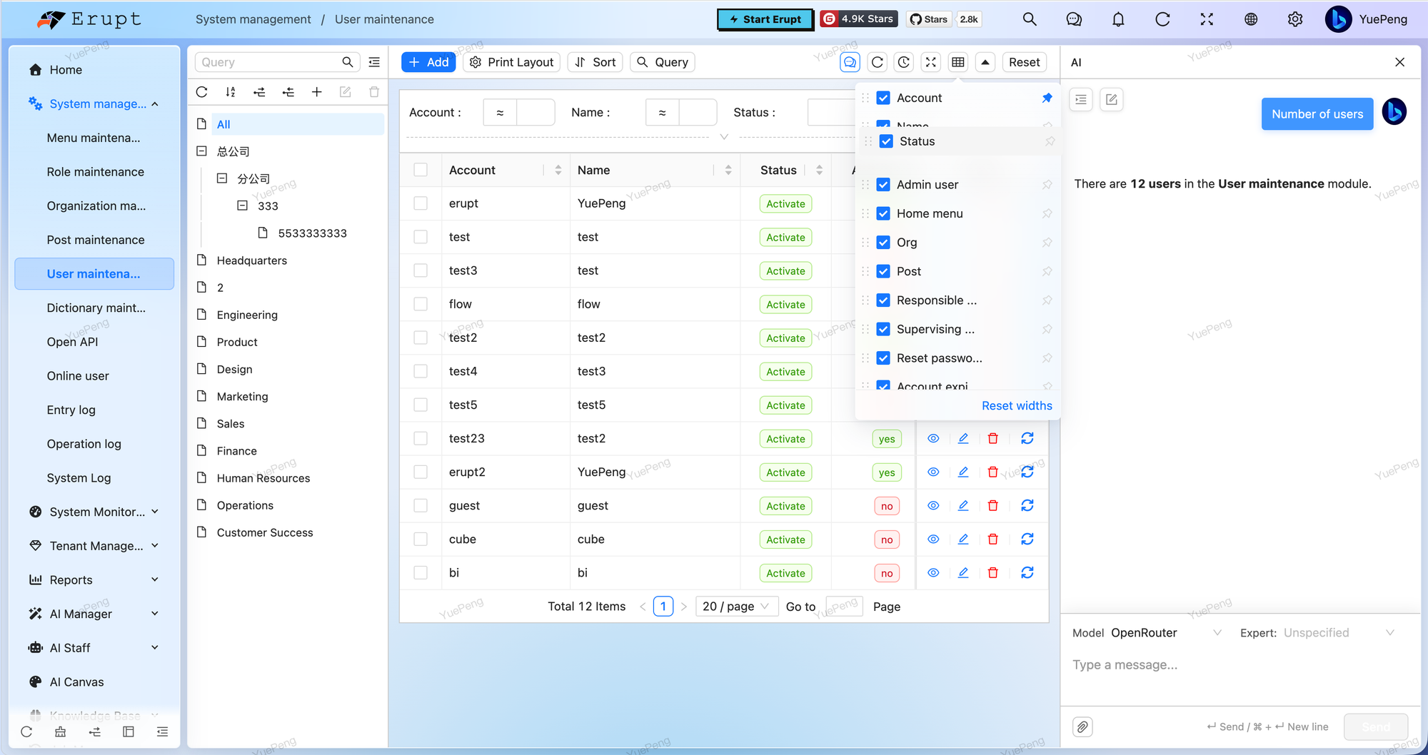
Column control
The ▦ button in the toolbar opens the column panel:
- Visibility: a checkbox per column
- Order: drag the handle on the left to reorder
- Pinning: the pin button cycles through pin-left → pin-right → unpinned
- Width: drag the header divider; "Reset widths" at the bottom of the panel restores the defaults
All of it is saved locally per model, so pages never interfere with each other.
Toolbar
| Action | What it does |
|---|---|
| Refresh / auto refresh | Refresh manually, or every 10s / 30s / 1min / 5min — the button lights up while it is on |
| Fullscreen | Expand the table area to the full screen |
| Query | Show or hide the search area; conditions and operators are remembered per model |
| Sort | Multi-field sort configuration |
| Print layout | Print the current row, or render it through a template |
| Import / Export | Excel import, export and template download (subject to @Power) |
| Duplicate row | Copy the selected row into a new-record form with the primary key cleared — handy for near-identical entries |
| Reset | Clear the search conditions and start over |
| AI | Opens the AI assistant panel on the right, scoped to the current model |
Search and views
- Switchable operators: every search field carries an operator dropdown (equals / like / greater than / between / multi-select …), remembered per model; the server can pin one with @Search(lockOperator)
- Multiple views: besides the table, a model can offer a board, calendar, card or gantt view, switched at the top and remembered per model
- Tree-driven filtering: with @LinkTree a tree appears on the left; picking a node filters the table, and the panel can be resized or collapsed
Cell rendering
Cells render according to @View(type), and several are interactive: images zoom on click, attachments open in a preview dialog with download, plus QR codes, progress bars, color swatches, Markdown / HTML and tags for booleans and choices. Long text is truncated with the full value on hover.
Bitable-style Editing v2.2.0+
Double-click a cell (or its edit icon) to change one field in place, without opening the row form — editing data the way a spreadsheet lets you.
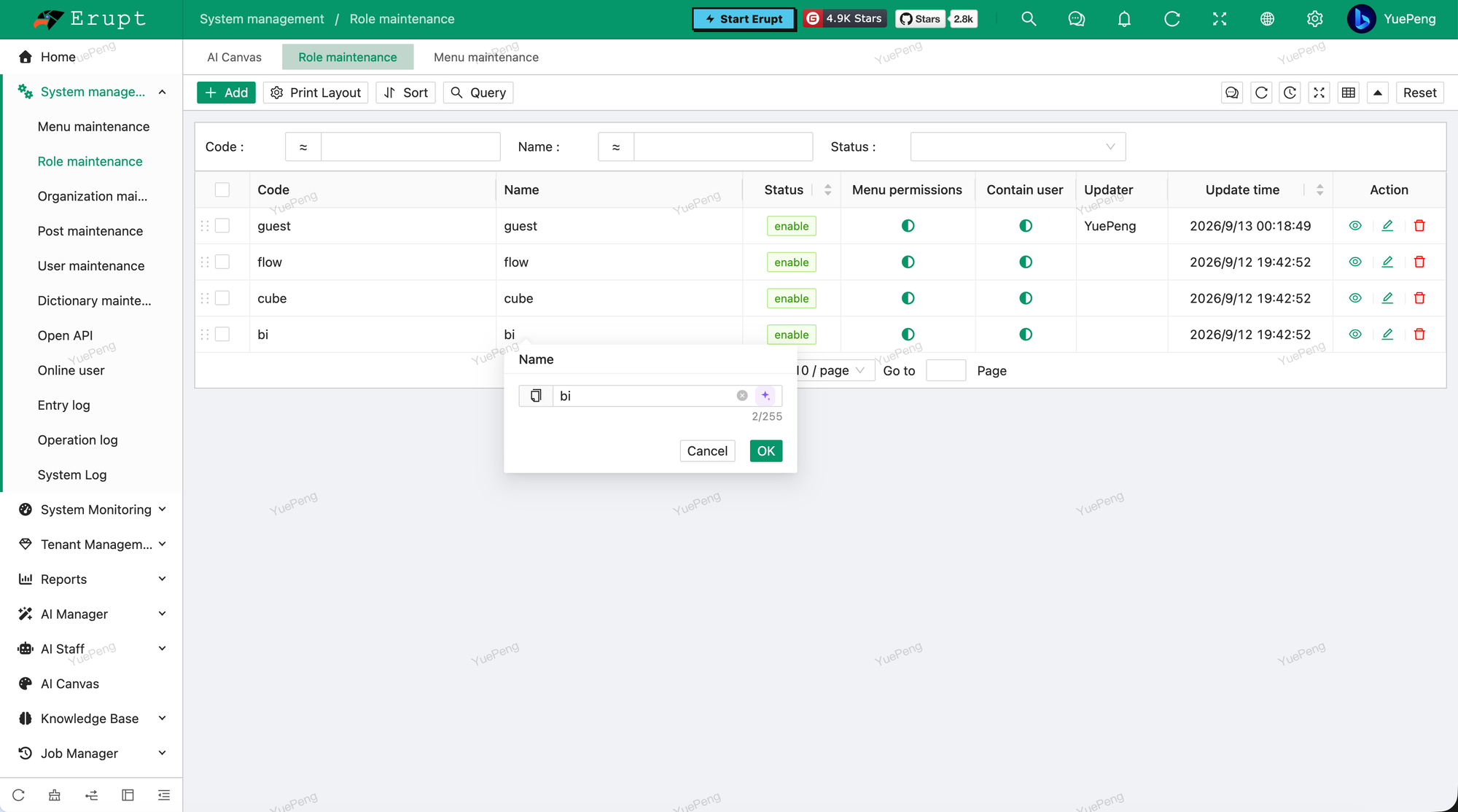
- The same control the form uses: the popover hosts the row form's own edit component, so value conversion, validation and reference pickers behave identically — copy button, AI writing assistant and character count included
- Validated as a whole row: the server patches the stored row with the new value and validates all of it, so a cross-field rule cannot be broken one cell at a time;
DataProxyand the operate log match a form submission - Two switches:
@Power(cellEdit)on the model and@Edit(cellEdit)on the field — accounts, role codes, secrets and the like are opted out by the framework already
See @Power → cellEdit for details.
In-row interaction
- Drag sort: with @DragSort configured, a grip appears at the start of each row — drag to reorder and the new order is saved
- Row actions: view, edit, delete, and any custom @RowOperation buttons
- Remembered paging: page size and the active view (table / card / gantt …) are kept per model
What each model remembers locally
Stored in the browser's localStorage under the key erupt.<model name>:
| Field | Meaning |
|---|---|
columns | Per-column visibility, width and pinning |
columnOrder | Column order |
treeWidth / treeCollapsed | Tree panel width and collapsed state |
aiPanelOpen / aiPanelWidth | AI panel state and width |
searchCollapsed / searchFieldsCollapsed / searchOperators | Search area state and the operator chosen per field |
pageSize | Rows per page |
visIndex | The active view |
This lives only in that browser: nothing is uploaded to the server and no other user is affected.
Dialogs & Forms
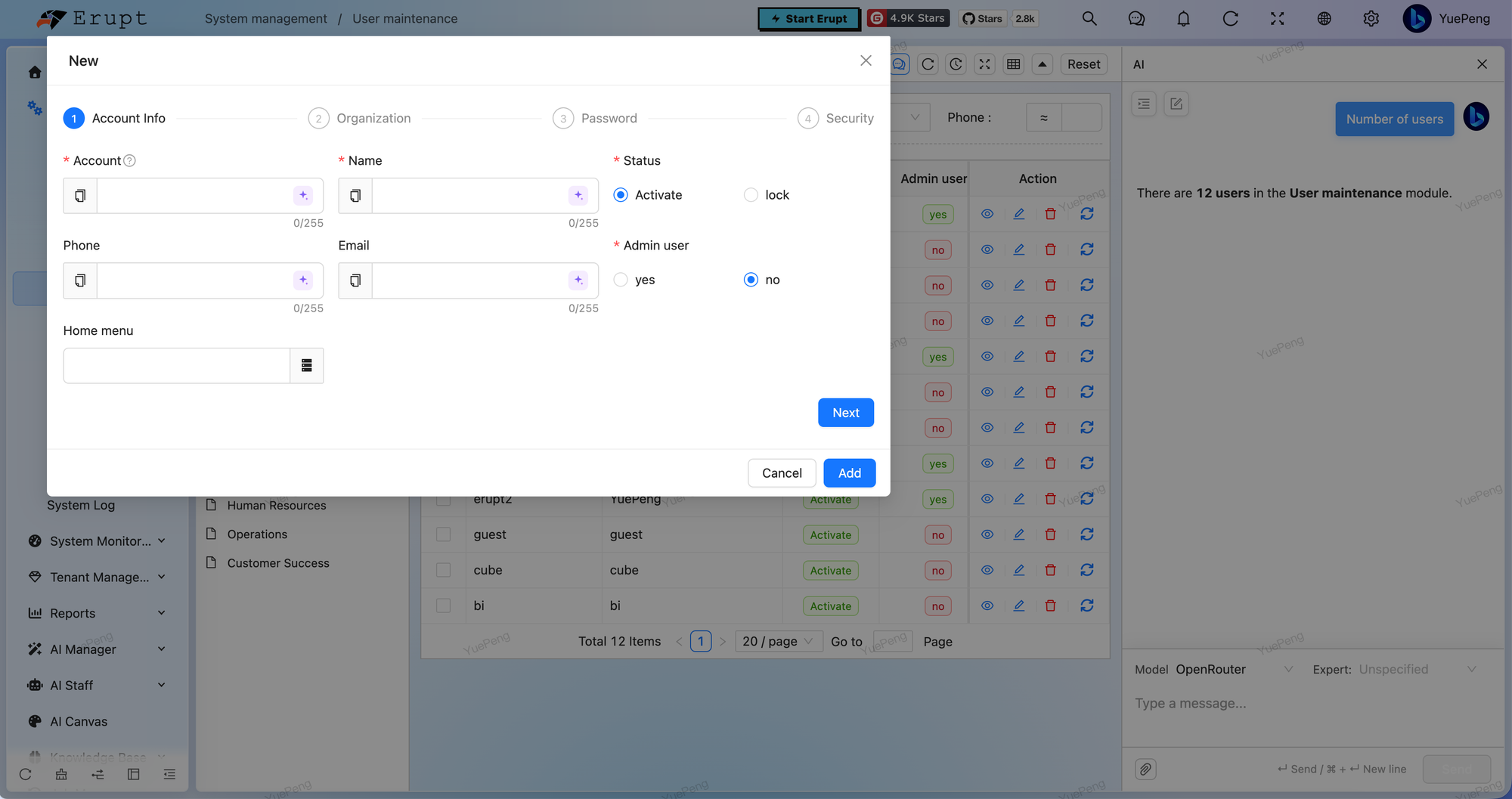
- Dialogs are draggable: add / edit, reference pickers, sub-tables, attachment pickers — every dialog moves by its title bar, so you can push it aside and read the table underneath while filling it in
- Step forms: long forms split into a wizard at each DIVIDE
- Input helpers: copy the current value from the left of the input, draft it with the AI writing assistant on the right, and watch the live character count below
- Code and rich text: the code editor, Markdown and rich-text fields all support fullscreen editing and copying
- Attachments: multi-attachment fields reorder by drag
Elsewhere in the Shell
| Capability | Notes |
|---|---|
| Watermark | Tiles "nickname-custom text-date" across the screen to discourage screenshots — see Configuration |
| Notifications | The bell in the header receives in-app notices live (requires erupt-notice) |
| Help entry | The question mark can point at your own docs site, via erupt-app.show-help-entry / help-doc-url |
| Languages | 12 built in, switchable from the login page and the header |
| Fullscreen | One click to take the browser fullscreen |
| Mobile | The layout adapts; the tab bar and some toolbar buttons hide on narrow screens |
Contributors
 YuePeng
 Claude Opus 5 (1M context)