
Frontend Messages & Modals
DANGER
Exposes public notification components that can be called from anywhere in the frontend, for example:
- Called inside
app.js - Called in custom pages using
parent.msg.xxx - Called in the return JS of custom buttons
- Called when erupt-websocket pushes a message
INFO
Note: Supported since 1.12.15+
Global Message Component
javascript
window.msg.info('This is a normal message');
window.msg.success('This is a normal message');
window.msg.error('This is a normal message');
window.msg.warning('This is a normal message');

// loading
let loading = window.msg.loading('This is a normal message', { nzDuration: 2500 });
// Manually dismiss the loading message
window.msg.remove(loading.messageId);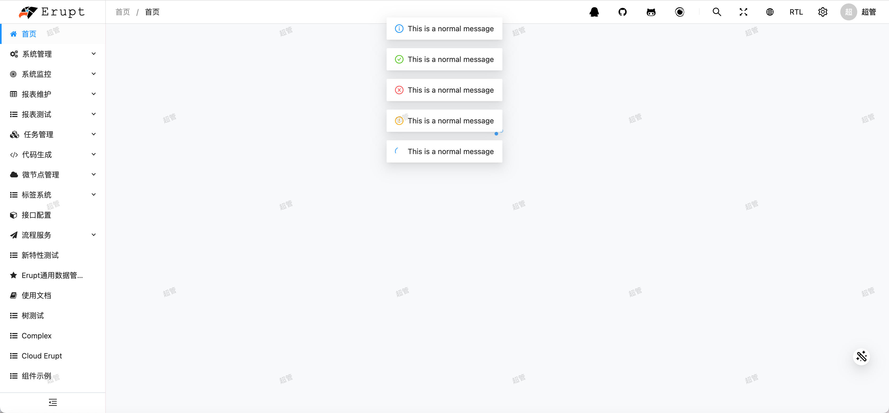
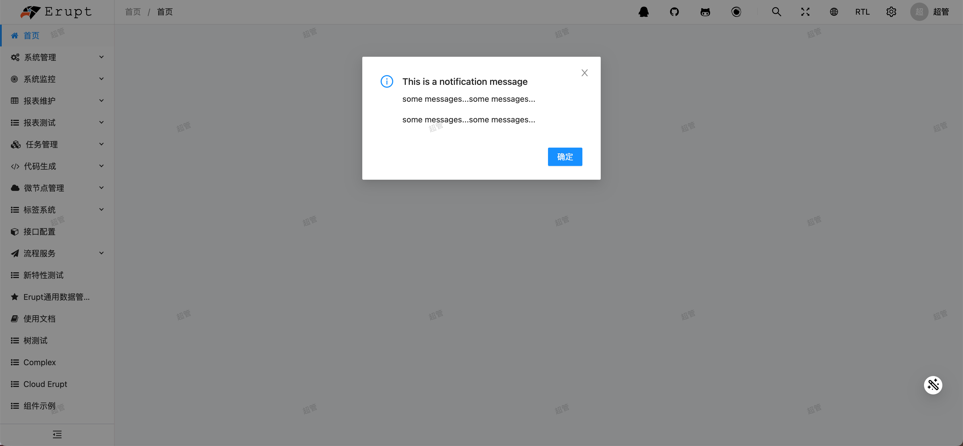
Modal Dialog Component
javascript
window.modal.info({
  nzTitle: 'This is a notification message',
  nzContent: '<p>some messages...some messages...</p>',
  nzOnOk: () => console.log('Info OK')
})
window.modal.success({
  nzTitle: 'This is a notification message',
  nzContent: '<p>some messages...some messages...</p>',
  nzOnOk: () => console.log('Info OK')
})
window.modal.error({
  nzTitle: 'This is a notification message',
  nzContent: '<p>some messages...some messages...</p>',
  nzOnOk: () => console.log('Info OK')
})
window.modal.warning({
  nzTitle: 'This is a notification message',
  nzContent: '<p>some messages...some messages...</p>',
  nzOnOk: () => console.log('Info OK')
})
window.modal.confirm({
  nzTitle: 'Are you sure delete this task?',
  nzContent: '<b style="color: red;">Some descriptions</b>',
  nzOkText: 'Yes',
  nzOkType: 'primary',
  nzOkDanger: true,
  nzOnOk: () => console.log('OK'),
  nzCancelText: 'No',
  nzOnCancel: () => console.log('Cancel')
})

// Close all modals
window.modal.closeAll();
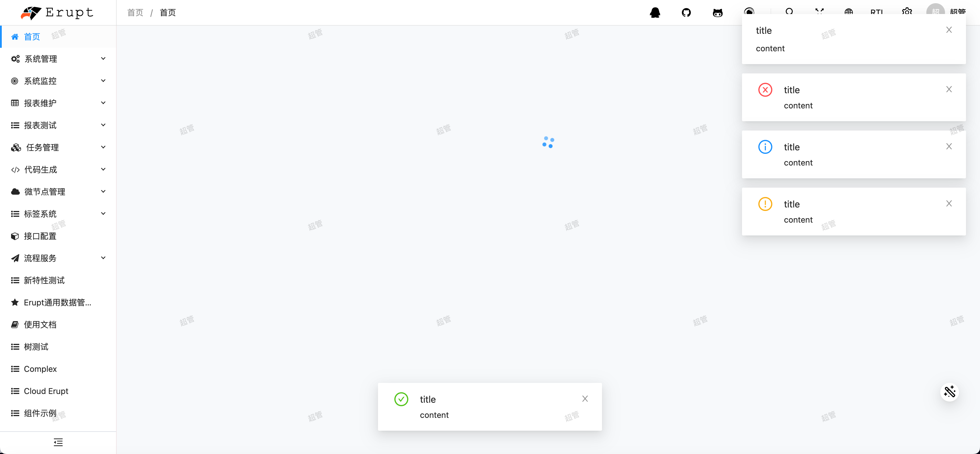
Notification Component
javascript
window.notify.blank('title', 'content', [options]) // Notification without icon
window.notify.success('title', 'content', {
  nzPlacement: 'bottom'
})
window.notify.error('title', 'content')
window.notify.info('title', 'content')
window.notify.warning('title', 'content')
options Parameters
| Parameter | Description | Type | Default |
|---|---|---|---|
nzDuration | Duration in milliseconds. Set to 0 to prevent auto-dismiss. | number | 4500 |
nzMaxStack | Maximum number of notifications displayed at the same time | number | 8 |
nzPauseOnHover | Pause auto-dismiss when the mouse hovers over the notification | boolean | true |
nzAnimate | Enable or disable animation | boolean | true |
nzTop | Distance from the top when notifications appear from the top | string | 24px |
nzBottom | Distance from the bottom when notifications appear from the bottom | string | 24px |
nzPlacement | Placement: topLeft topRight bottomLeft bottomRight top bottom | string | topRight |
nzDirection | Text direction of the notification | 'ltr' | 'rtl' | - |
Rendering HTML in Components
Supported since 1.12.23+
By default, message, modal, and notification components only accept plain text. To render HTML, wrap the content with window.safeHtml to tell the framework the HTML is safe to render:
javascript
window.msg.error(window.safeHtml(`
    An error occurred
    <button style="margin-left:20px" onclick="window.location.hash = '/xxx'">View</button>
`), {
    nzDuration: 5000
})
Contributors
 YuePeng
 Claude Opus 5 (1M context)